Skip to Main Content
Dell Design System
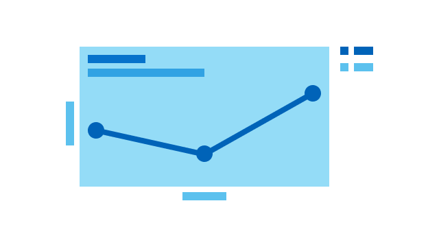
Line Chart
Line charts connect a series of data points using a line, and are commonly used to show data trends over time.